Luxury Interior Design Trends 2027: What Will Actually Last
Luxury interior design trends 2027 share one direction: rooms are meant to feel like someone lives in them again. After a decade of smooth white walls, grey sofas and beige-on-beige schemes that looked the same in every city, attention is moving to materials with weight, colour with depth and floor plans that allow retreat. The major forecasts from Pantone and WGSN point the same way, and our own project work has been heading there for some time. This guide separates the 2027 trends with substance from the ones that will last a single season, and shows where an investment pays off well beyond next year.
Luxury Interior Design Trends 2027: From a Look to a Language
The defining shift for 2027 is not a single style but an attitude. Forecasters agree on more contrast, more personality and fewer rules about what belongs together. Pantone named its 2027 Home + Interiors forecast "Sense-Abilities": colour and design that engage every sense, not just the eye. WGSN and Coloro chose Luminous Blue as their Colour of the Year 2027, a shade that is anything but restrained.
In practice, this means the perfectly styled room that works on camera is losing its appeal. What clients ask for now is a room that holds up in daily life and shows character. That is good news for anyone thinking long term, because an interior with its own design language ages far more slowly than one that copies a look.
We read every trend with one question: is this a new surface or a new attitude? Surfaces change every year. Attitudes shape a decade. Most of the luxury interior design trends for 2027 belong to the second category, which is exactly why they deserve a closer look.
2027 Materials: Darker Woods, Honest Stone, Textured Walls
Material honesty runs through the whole year. Solid wood with visible grain, oiled or brushed rather than lacquered, natural stone with real movement, and textiles with a hand: linen, wool, corduroy, bouclé. Imitations that merely print wood or stone lose ground as the desire for touch grows.
Walnut Replaces Pale Oak
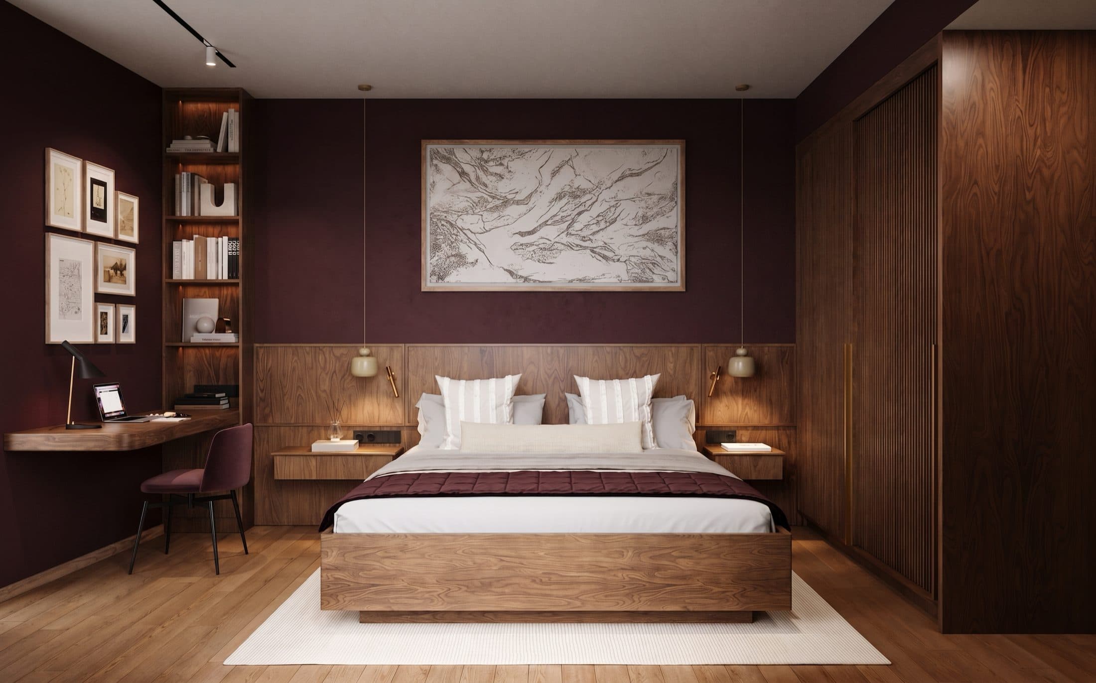
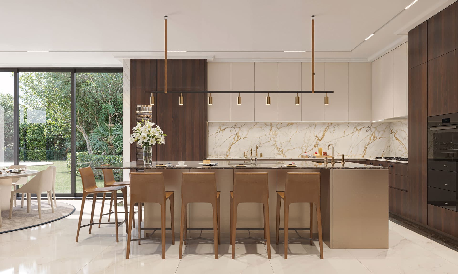
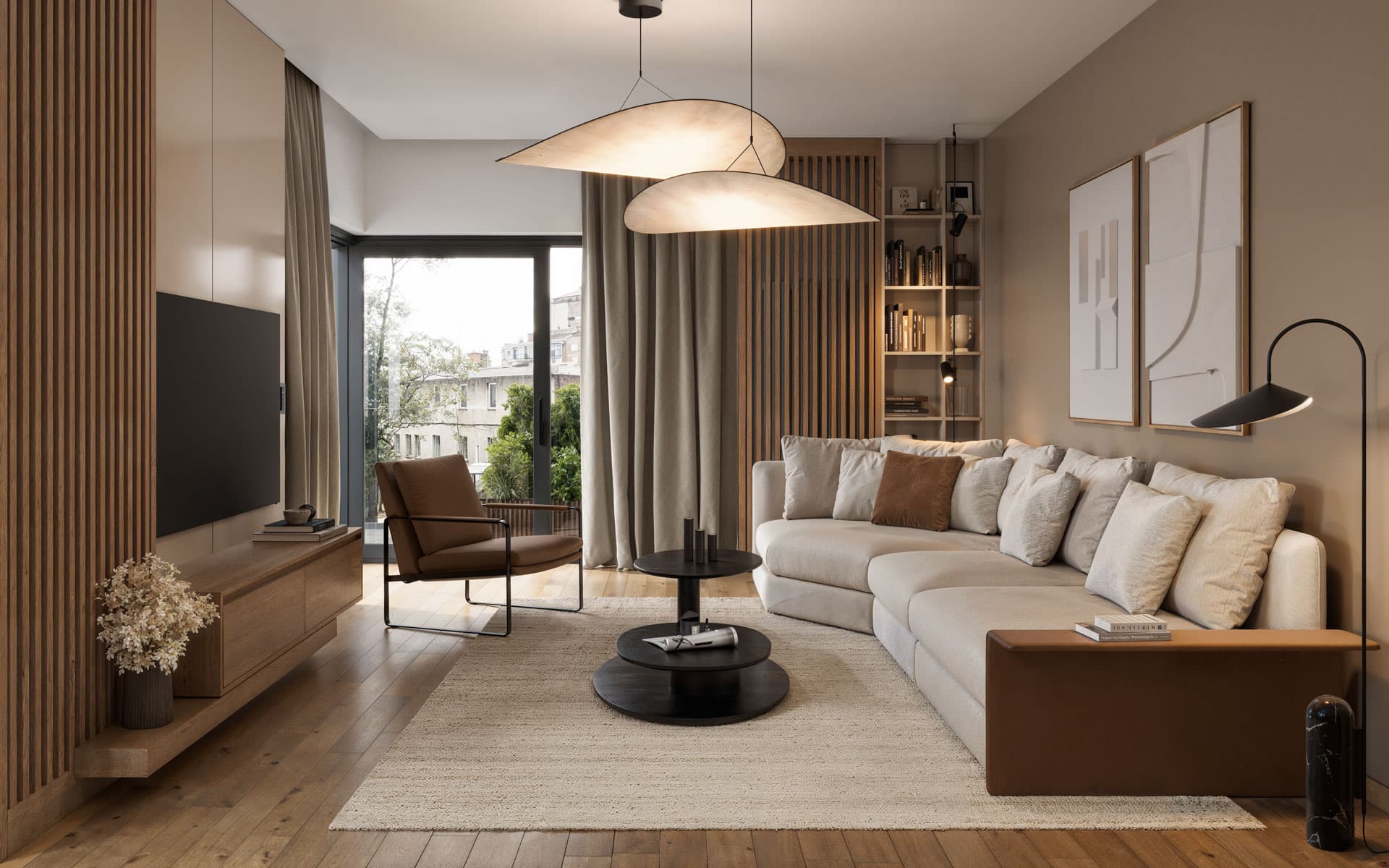
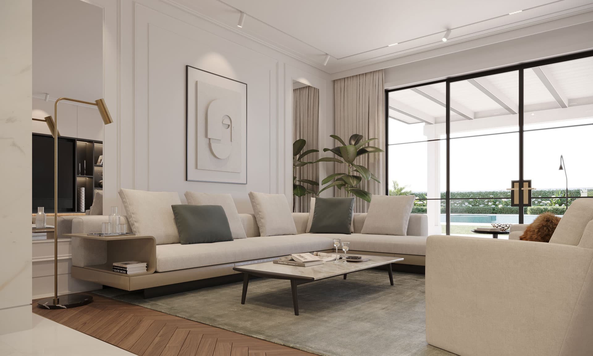
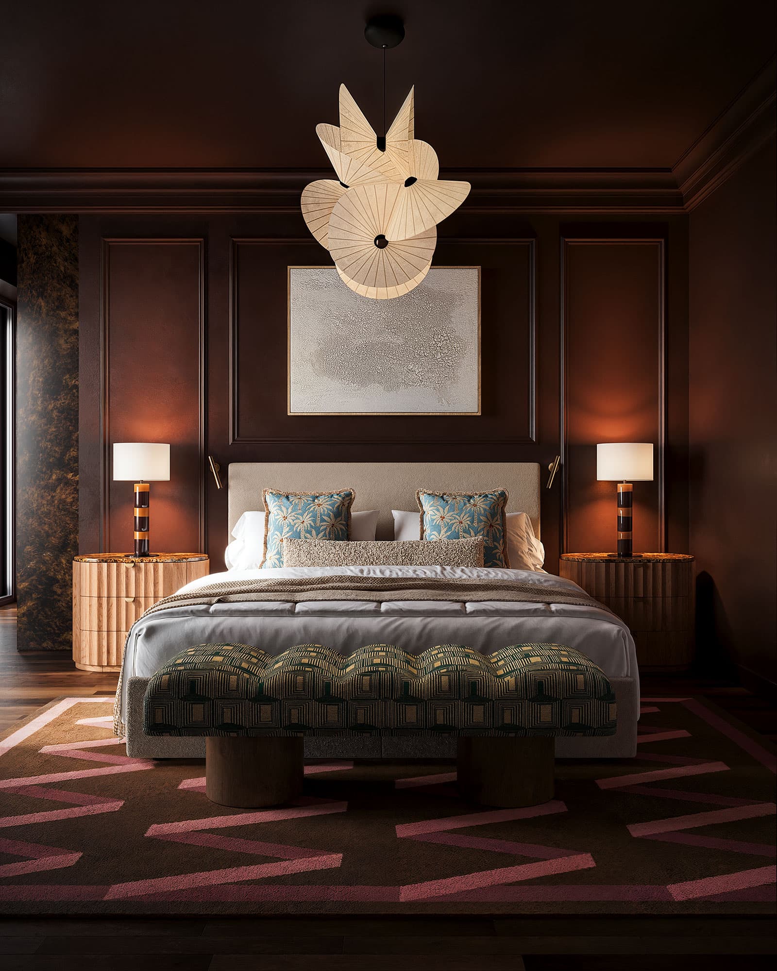
The most visible shift is in timber. After ten years of pale, almost white oak, darker and warmer woods are returning: walnut, smoked oak, cherry, with burl as an accent. In the City Condo, walnut carries every piece of joinery, from the kitchen run and the bookcase partition to the bedroom headboard. In the Calabasas Residence, walnut herringbone runs through the living areas, and in the master bedroom a burl nightstand and mirror frame provide the accent. Dark wood asks for more light and a calmer setting, but it rewards both with a depth that pale timber cannot reach.
Stone as Surface, Not Tile
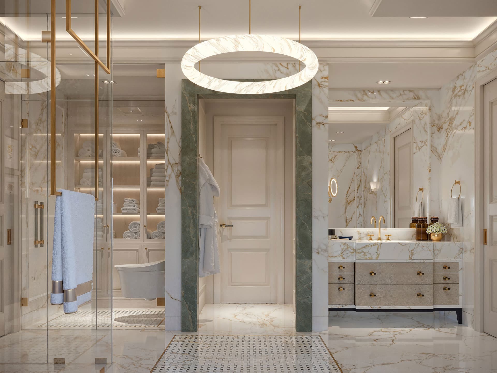
Natural stone is used more generously in 2027: as full wall cladding with mitred corners, as lined niches, as solid vanities. Full slabs replace small-format tiles, and honed finishes overtake polished ones because they feel warmer and age with more dignity. Travertine remains one of the most requested stones, but it needs careful specification, which our travertine interior design guide covers in detail.
The Wall Comes Back
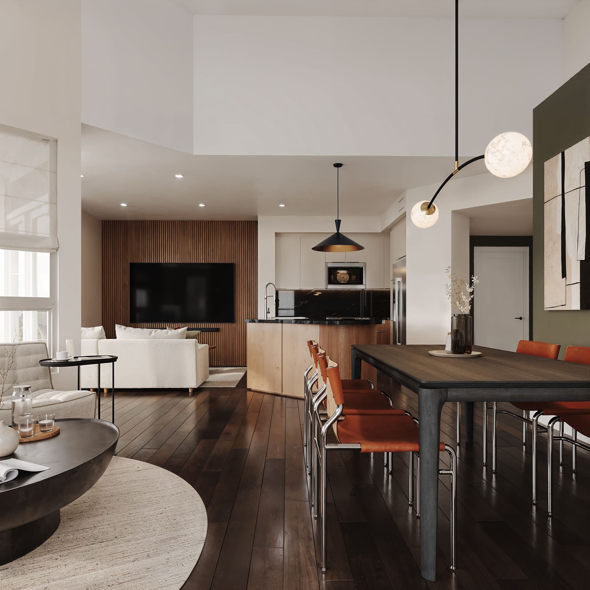
For years, walls were expected to be smooth and white. In 2027 they get a role again: lime plaster and tadelakt, fluted timber panelling, upholstered walls, wallpaper and even leather. In the Family Home Vero Beach, a blue leather wallcovering carries the entire identity of a bedroom, because every other decision was made to sit behind it. In the City Condo, fluted walnut gives the media wall a textured field, so the wall holds its own when the screen is off. Texture on the wall is the simplest way to give a room depth without buying a single piece of furniture. For the materials that hold their value longest, see our guide to timeless materials.
Our Projects
2027 Colour: Luminous Blue, Burgundy and Warm Earth
Grey is finished, and cool white is losing ground too. The 2027 palette is built on warm earth tones: sand, mocha, terracotta, umber, chocolate brown and muted olive. Above them sit deep accents in burgundy, forest green and blue. Instead of hard contrast, rooms work within one colour family across different surfaces.
Luminous Blue, the WGSN and Coloro Colour of the Year 2027, is a saturated blue that recalls lapis lazuli and cobalt. Its companions are Energy Orange and Meadowland Green. Pantone usually announces its own Color of the Year in early December. In a home, a blue this strong works best where it has texture: as velvet upholstery, as lacquer, as leather or as a glaze over lime plaster. As a flat-painted living room wall, the same shade quickly turns hard.
Burgundy is the second colour gaining weight in 2027. In the City Condo it begins in the corridor and continues into the bedroom, paired with walnut at every point where the room is touched. The apartment has a light, open half and a dark, enclosed half as a result. Dark colours belong where you rest, not where you work.
Colour Drenching Stays
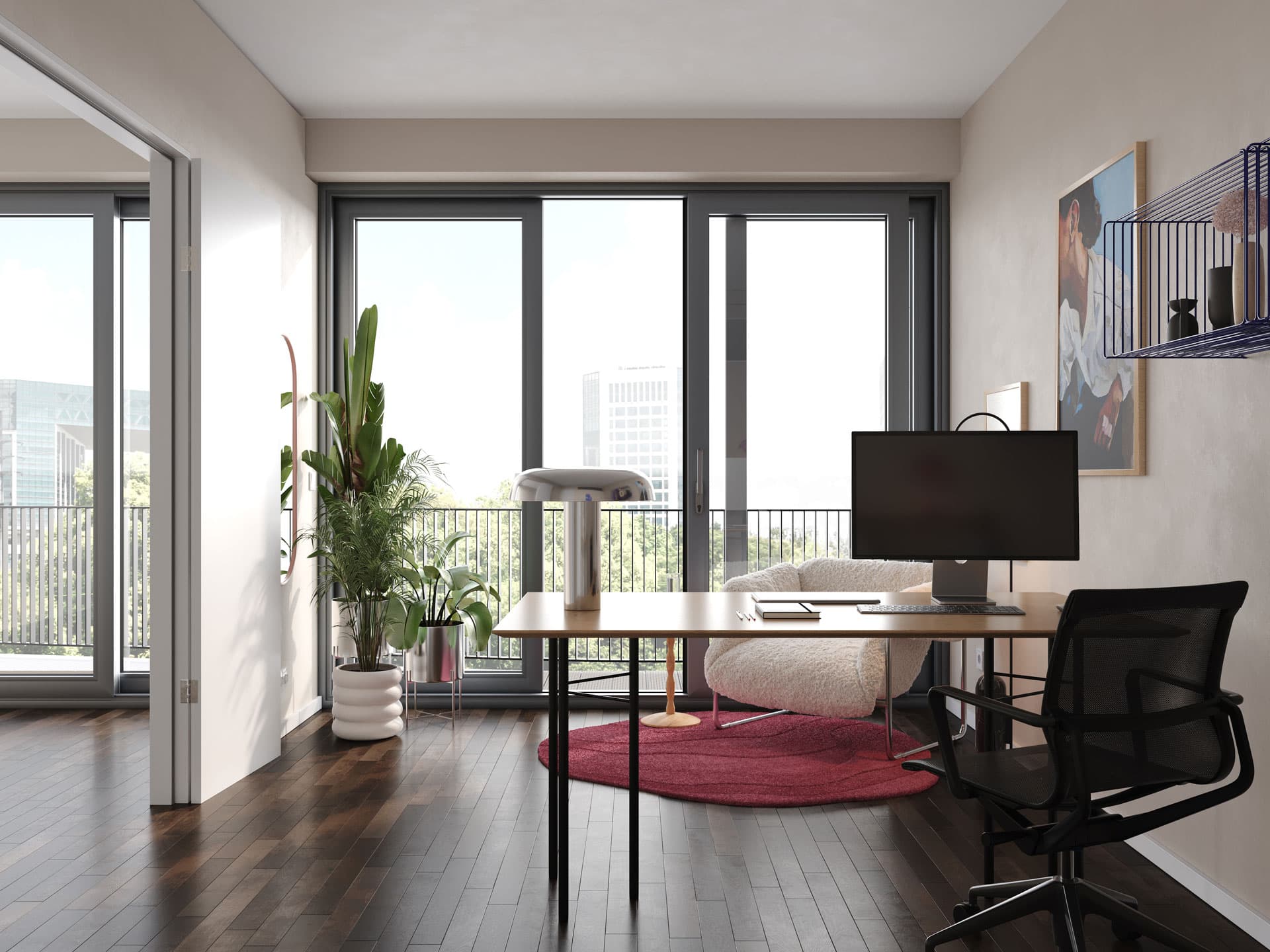
Colour drenching, one tone across walls, ceiling, joinery and textiles, remains one of the strongest tools in 2027. In the Berlin Bedroom, we chose the tone after observing the daylight across a full day; because the colour is constant, texture does the work: matte walls, a slightly higher sheen on the ceiling, linen, brushed metal. That is the difference from the beige-on-beige of recent years: tonal schemes only work when the surfaces differ.
Sensory Design: Sound, Touch and Light
Pantone's "Sense-Abilities" is not only about colour. The warm modern interior of the last few years is becoming a sensory one: it keeps its wood and low profiles but adds acoustic softness and heavily layered texture. In a luxury home with stone floors and large glazed walls, sound is often the most neglected sense. Upholstered walls, full-height curtains, wool rugs and timber slats bring reverberation down and make a room feel noticeably calmer before anyone has noticed why.
Wellness moves further into the home. Saunas, massage rooms and spa-grade bathrooms are now part of residential briefs rather than hotel ones. In the Ocean Villa, the massage room is lined floor to ceiling in honed travertine, and a walnut home gym sits alongside it in the same wellness suite. These rooms are designed for the body first: warm surfaces underfoot, soft acoustics, no visible light sources.
Light is the foundation of every sensory room. Luxury lighting is becoming more sculptural where it is meant to be seen and more invisible where it is not. Concealed coves, lit joinery and recessed lines carry the ambient light, while one or two expressive pieces act as objects. The techniques behind the invisible half are covered in our post on invisible lighting techniques.
Curves, Upholstery and the Single Statement Piece
Hard corners are losing their grip. Sofas and armchairs arrive in 2027 with organic curves, deep seats and generous upholstery, and modular sofas stay popular because they adapt to changing lives. What matters is where the curve comes from. The short-lived wave of inflated, bubble-shaped furniture is already fading, because it was fashion rather than an answer to a problem.
Curves that last are architectural. In the City Condo, the corner of the tall kitchen units is rounded from plinth to ceiling because it stands in the busiest route through the apartment. A square edge would cut into that path; the curve lets movement slide past. The same radius returns on the dining bench and on the edge of the bedroom desk. A curve that follows movement does not date.
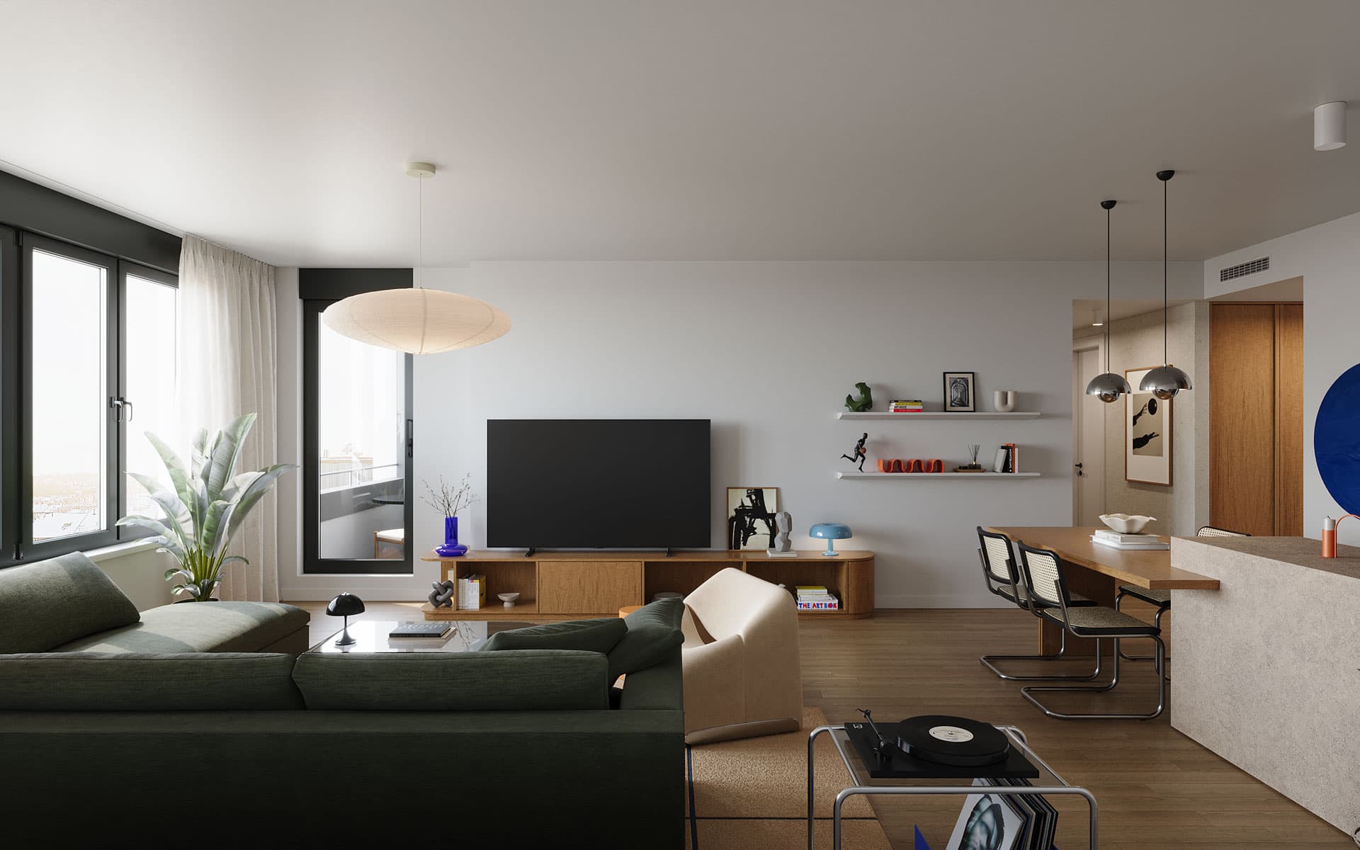
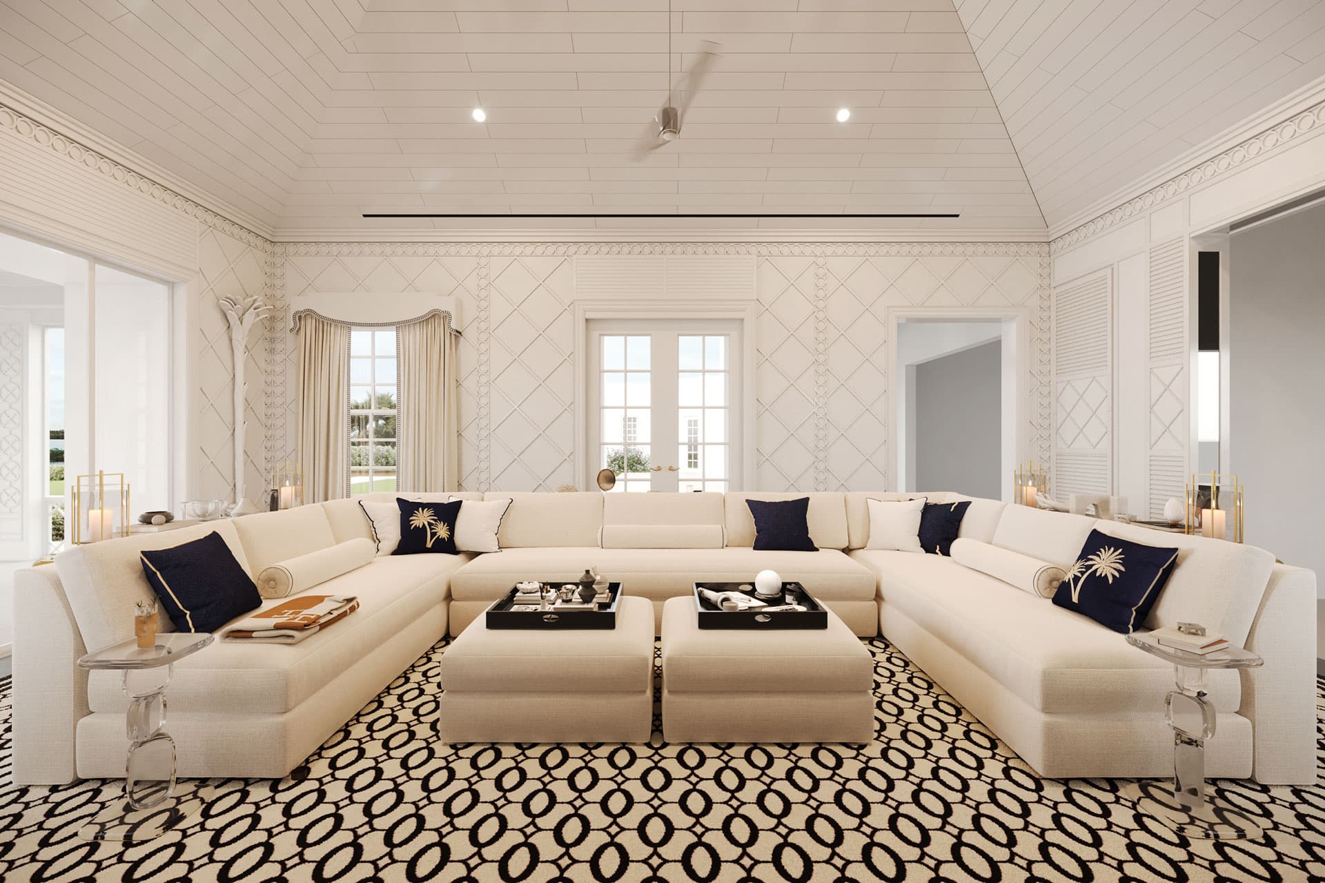
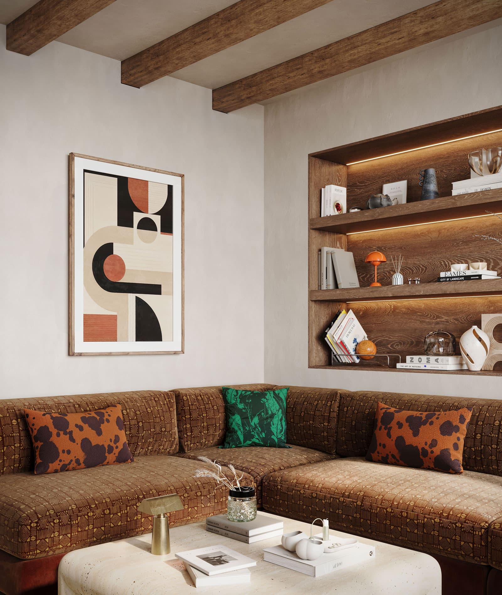
With furniture, 2027 means fewer pieces, chosen more deliberately. One strong armchair or one exceptional light gives a room more character than a dozen small decorative objects. Jewel tones appear in velvet and lacquer, usually on a single upholstered piece. In the Midcentury Apartment, a green velvet sectional is the only strong colour in the living room, surrounded by white oak millwork, and that concentration is what makes it work. Rugs are back too: in the Calabasas Residence, a green rug anchors the family room and gathers sofa, armchairs and coffee table into one group.
Defined Zones and Analogue Rooms
The open plan stays, but it is changing. Clients want more privacy, clearly defined zones and flexible rooms for work and quiet. Fully open kitchens with no visual separation are losing appeal, and closed storage is replacing open shelving where everyday life used to pile up.
The most elegant answer is zoning that is built rather than furnished. In the City Condo, a bookcase partition stands between the kitchen and the seating area: a solid walnut base hides pans and appliances from the sofa, while open shelves above it let daylight through to the kitchen. The room stays open but gains structure. A lighter version that appears often in 2027 is the full-height curtain, used as a room divider, in front of wardrobes or to hide the television.
Analogue Rooms
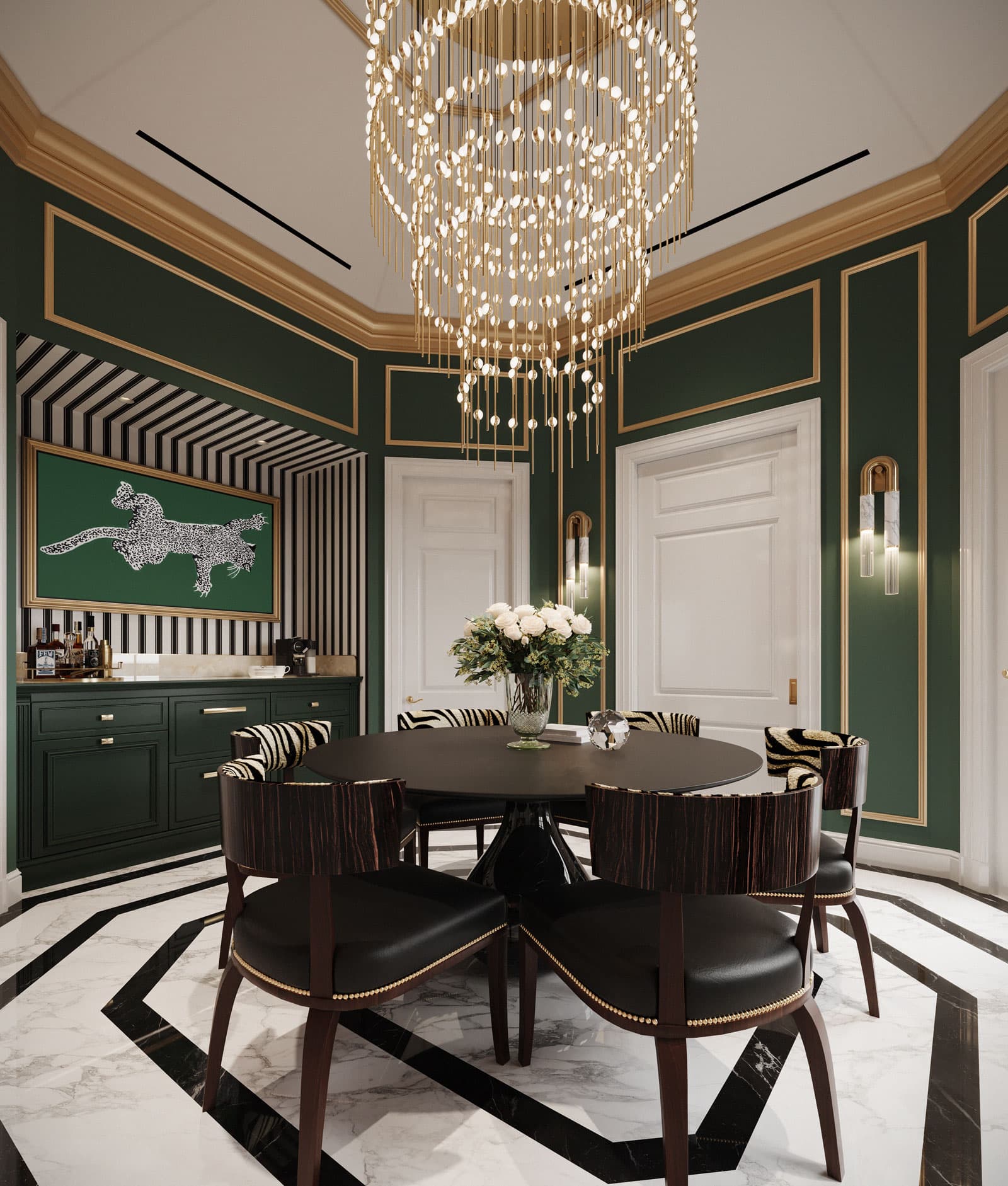
A new room type is gaining ground: the room without a screen. Libraries, music rooms, game rooms, places to switch off. Our Game Room, a private room in deep green and brass built around a bespoke poker table, shows how completely such a space can be designed. All light is specified at 2700K so that the green and brass stay in their warmest register. Even in a smaller home, an analogue zone is possible, often as a reading nook with its own light.
What Comes After Quiet Luxury
Quiet luxury was one of the defining terms of recent years, and 2027 raises the question of what remains of it. The answer is clear: the materials stay and the repetition goes. Travertine, linen, oiled oak, lime plaster and unlacquered brass lose none of their value. What has worn thin is the same beige-on-beige reproduced in thousands of homes under the label.
The successor to quiet luxury is not its opposite but its evolution: the same material quality with more contrast, darker wood, stronger texture and one deliberate colour accent, plus a touch of wabi-sabi in its respect for the aged and imperfect. Anyone who understood quiet luxury properly has nothing to change in 2027, because it was never about a colour. We explain what the style really demands in our post on quiet luxury interior design.
Berlin offers a good example of where this is heading. In an Altbau apartment, the stucco, plank floors and panelled doors already supply the texture and history that 2027 asks for. Paint can run over cornices and ceilings instead of picking them out in white, and dark walnut joinery sits well against restored pale floorboards, because the contrast sharpens both.
What Is Fading in 2027, and What to Keep
Every change in direction produces a list of what is "out". It is useful as long as it is not read as an instruction to throw things away. These are the directions clearly losing ground in 2027:
- Grey monotony - cool grey on walls, sofas and floors now reads as cold and dated.
- Beige without texture - tonal schemes stay, but only with varied surfaces.
- Stark minimalism - empty, smooth rooms are giving way to layered, personal ones.
- Pale oak everywhere - as the only timber in a home, it increasingly looks generic.
- Novelty bubble furniture - curves stay, exaggerated forms without purpose do not.
- Plans with no retreat - fully open floors are giving way to defined zones.
What you should not replace: good natural stone, solid wood, quality joinery and a considered lighting scheme. These form the shell of a room, and they sit outside any trend cycle. Our advice follows a clear order. Invest in the shell, meaning floors, walls, light and joinery, and play with trends where replacement is easy: textiles, cushions, rugs and single upholstered pieces. A velvet cover in Luminous Blue can be changed in five years; the wrong stone floor cannot.
Frequently Asked Questions
What are the biggest interior design trends for 2027?
The biggest interior design trends for 2027 are darker woods such as walnut, natural stone used as full cladding, textured walls in lime plaster, panelling or wallpaper, warm earth tones with strong accents in blue and burgundy, organically curved upholstery, acoustic softness and floor plans with defined zones instead of fully open space.
What is the colour of the year 2027?
WGSN and Coloro named Luminous Blue, a saturated lapis and cobalt blue, as their Colour of the Year 2027, with Energy Orange and Meadowland Green as companions. Pantone usually announces its own Color of the Year in early December, and its 2027 Home + Interiors forecast is titled "Sense-Abilities".
Is quiet luxury still in style in 2027?
The materials of quiet luxury remain fully current: natural stone, oiled wood, linen and lime plaster. What is fading is uniform beige-on-beige. In 2027, quiet luxury evolves towards more contrast, darker timber, stronger texture and a single confident colour accent.
Which interior design trends are going out in 2027?
Grey monotony, beige without texture, stark minimalism, pale oak as the only timber in a home, novelty bubble furniture and fully open plans with no place to retreat are all losing ground. Quality materials and joinery are not part of that list and should be kept.
Would you like to know which of these directions suit your home and which you can safely ignore? Get in touch for a first conversation, or explore our projects to see how we translate material, colour and light into interiors with their own design language.
Ready to Bring These Ideas Home?
Tell us about your space and we will show you how these ideas could work for you. The first consultation is free and without obligation.